
One of my favorite data sources is the NYC OpenData site. A while back I noticed a really interesting data set on that site, and I’ve been mulling over what exactly to do with it for a while. The data set in question is the 2015 Street Tree Census. I knew there was some interesting question that this data could answer, I just had to think of it (or ask my girlfriend to think of it for me.) She wanted to know if poorer areas had fewer street trees. While this isn’t a question that the street tree census can answer alone, data about location and income shouldn’t be too hard to come by. I decided to use the tidycensus package to grab information about median income levels in New York.
First things first, I downloaded the data. Then I subsampled it just to play around a bit. I wanted to make sure I had a handle on the structure, so I decided to whip up a quick map of tree locations in the subsampled data.
# Download data from the NYC Open Data API
download.file("https://data.cityofnewyork.us/api/views/uvpi-gqnh/rows.csv?accessType=DOWNLOAD&api_foundry=true",
              destfile = "data/trees.csv")
# Read in and subsample the dataset
trees <- read_csv("../../data/trees.csv", progress = FALSE)## Parsed with column specification:
## cols(
## .default = col_character(),
## tree_id = col_integer(),
## block_id = col_integer(),
## tree_dbh = col_integer(),
## stump_diam = col_integer(),
## postcode = col_integer(),
## `community board` = col_integer(),
## borocode = col_integer(),
## cncldist = col_integer(),
## st_assem = col_integer(),
## st_senate = col_integer(),
## boro_ct = col_integer(),
## latitude = col_double(),
## longitude = col_double(),
## x_sp = col_double(),
## y_sp = col_double(),
## `council district` = col_integer(),
## `census tract` = col_integer(),
## bin = col_integer(),
## bbl = col_double()
## )## See spec(...) for full column specifications.trees_small <- trees %>%
sample_n(1000)# Plot the trees_small dataset
trees_small %>%
leaflet() %>%
addTiles() %>%
addCircles(lng = ~ longitude, lat = ~ latitude)That done, I decided it was time to get my hands dirty with tidycensus. I got up and running using Julia Silge’s fantastic blog post. This gave me everything I needed to dig into some census data.
First, I downloaded median income at the tract level, along with tract geometry, for each of the five counties that make up New York City. This data took a bit of cleaning until I was happy with it, but overall not so bad. tidycensus really lives up to the “tidy” in its name. All I had to do was a little string manipulation. I did this to make the way the tracts were described match up with the format used in the trees data set. In a little bit, I’ll join these two data.frames together by tract, so I wanted them to match.
# Create a vector of county names to iterate over
counties <- c("New York County",
              "Kings County",
              "Queens County",
              "Bronx County",
              "Richmond County")

# Use purrr to loop through the counties and download median income at the
# at the tract level along with tract geometry
new_york <- map(counties,
                ~ get_acs(
                  geography = "tract",
                  variables = c(medincome = "B19013_001"),
                  state = "NY",
                  county = .x,
                  geometry = TRUE
                )
)


# rbind() together the elements of the list returned by map
# It has to be done this way because of the geometry column, map_df doesn't work
new_york <- rbind(new_york[[1]],
                  new_york[[2]],
                  new_york[[3]],
                  new_york[[4]],
                  new_york[[5]])

# Do a little string cleaning to get the tract names to match the trees dataset
new_york <- new_york %>%
  mutate(
    tract = str_extract(NAME, "[0-9\\.]{1,}"),
    tract = str_replace_all(tract, "\\.", "")
  ) %>%
  separate(NAME, into = c("census tract", "county", "state"), sep = ", ")
Let’s take a look at what the median income looks like across the city!
# Create color palette
pal <- colorNumeric(palette = "plasma",
                    domain = new_york$estimate)

# Add crs for plotting and make a leaflet map
new_york %>%
  st_transform(crs = "+init=epsg:4326") %>%
  leaflet() %>%
  addTiles() %>%
  addPolygons(stroke = FALSE,
                smoothFactor = 0,
                fillOpacity = 0.7,
                color = ~ pal(estimate)) %>%
  addLegend("bottomright",
              pal = pal,
              values = ~ estimate,
              title = "Median Income",
              opacity = 1)
First, I’m going to add a new column called to the new_york dataframe called area that’s just the area of each census tract. I’ll use this later to calculate the number of trees per unit area.
# Add area column
new_york <- new_york %>%
  mutate(area = st_area(geometry))
Next, I’ll count the number of trees in each tract. This is easy because the trees data set has a census tract column that tells you which tract of the county each tree is in, so all you have to do is group by borough (in this case equivalent to county) and census tract, then count the number of observations.
Then I added a county column so that I can use it in the next step to join the trees data set with the census ACS data.
# Coount the number of trees in each tract and create the county column
trees_count <- trees %>%
  group_by(borough, `census tract`) %>%
  summarize(n = n()) %>%
  ungroup() %>%
  mutate(borough = factor(borough),
         county = fct_recode(borough,
                             `Kings County` = "Brooklyn",
                             `New York County` = "Manhattan",
                             `Bronx County` = "Bronx",
                             `Queens County` = "Queens",
                             `Richmond County` = "Staten Island"
         ),
         county = as.character(county),
         `census tract` = as.character(`census tract`)

  )
This is the final join that combines these two data sets. I chose a right join because I want one row for every tract that includes the number of trees in that tract as a variable.
# Join the dataframes
trees_count_new_york <- trees_count %>%
  right_join(as_tibble(new_york), by = c("county" = "county", "census tract" = "tract"))
Now I’ll do some sanity checking on my data to make sure everything looks good. It turns out that I have some NAs. My best guess is that these represent tracts with no trees. This is backed up by the fact that there’s at least one tract with only a single tree. If it’s possible to have one tree, it’s probably possible to have no trees in a tract.
# How many NAs do I have?
sum(is.na(trees_count_new_york$n))
## [1] 36# What's the range of the column n
range(trees_count_new_york$n, na.rm = TRUE)## [1] 1 3615In this next chunk, I do a bit of data manipulation. I replaced the NAs in the number of trees column with zeroes. I also calculated the quantity trees_per_km2 using the area column. This is a better measure of the number of trees in a tract as it controls for the physical size of the tract. Finally I put median income on a scale of tens of thousands of dollars. This makes the numbers easier to wrap your head around and interpret later on.
# A bit of munging
trees_count_new_york <- trees_count_new_york %>%
  mutate(n = ifelse(is.na(n), 0, n),
         trees_per_km2 = as.numeric(n / area) * 1000,
         med_income = estimate / 10000)
Now let’s take a look at a plot of our data!
# Plot the data!
ggplot(trees_count_new_york, aes(med_income, trees_per_km2)) +
  geom_point() +
  geom_smooth(method = "lm")
## Warning: Removed 63 rows containing non-finite values (stat_smooth).## Warning: Removed 63 rows containing missing values (geom_point).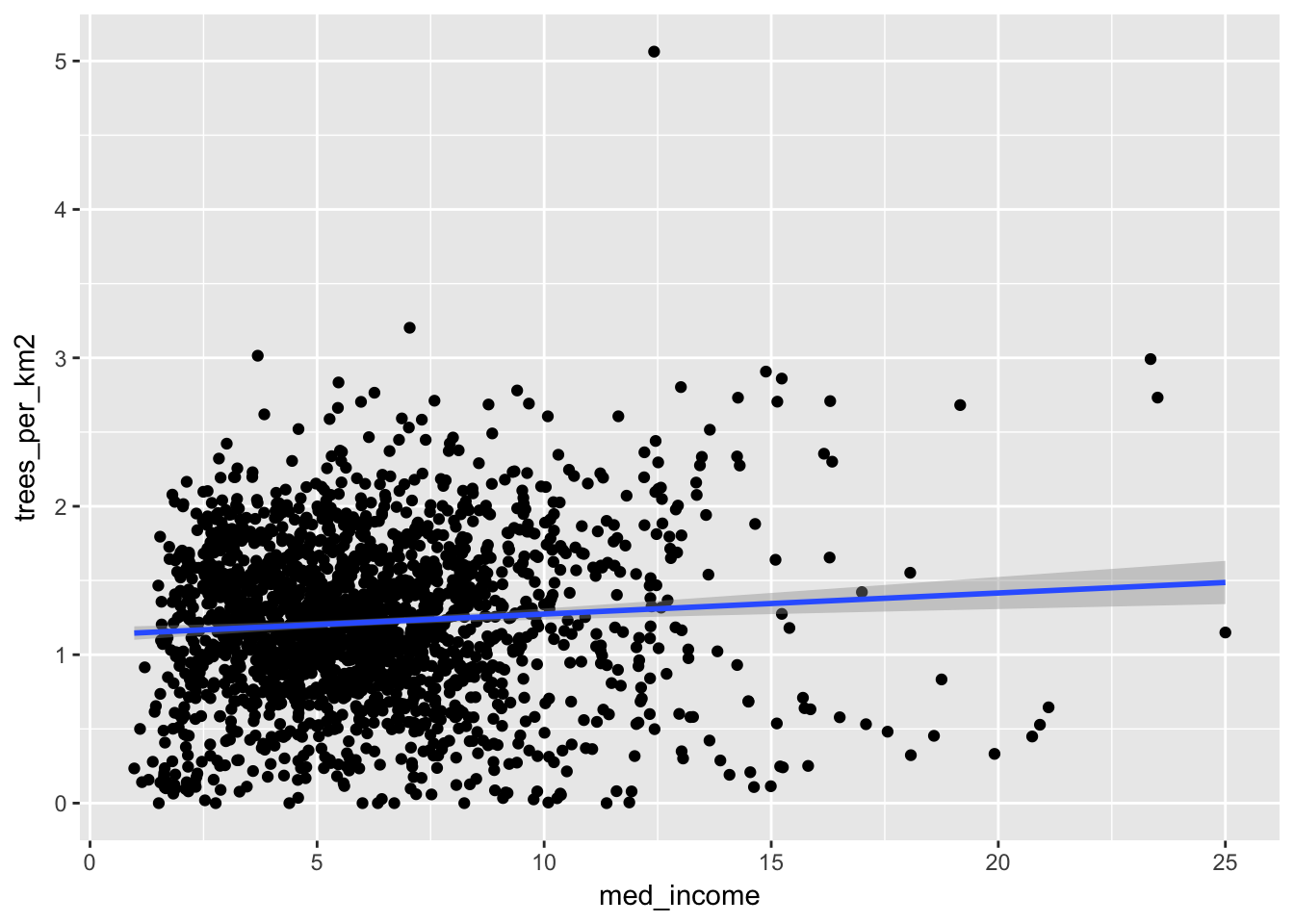
Here it looks like there’s a very slight positive trend, indicating that higher income areas do have more street trees. But is this significant? We can fit a linear model to find out.
# Drop NAs before fitting the model
trees_count_new_york_complete <- trees_count_new_york %>%
  drop_na()

# Fit the linear model
lin_mod <- lm(trees_per_km2 ~ med_income, data = trees_count_new_york_complete)
summary(lin_mod)
##
## Call:
## lm(formula = trees_per_km2 ~ med_income, data = trees_count_new_york_complete)
##
## Residuals:
## Min 1Q Median 3Q Max
## -1.3022 -0.3432 0.0026 0.3425 3.7480
##
## Coefficients:
## Estimate Std. Error t value Pr(>|t|)
## (Intercept) 1.13505 0.02655 42.754 < 0.0000000000000002 ***
## med_income 0.01448 0.00390 3.712 0.000211 ***
## ---
## Signif. codes: 0 '***' 0.001 '**' 0.01 '*' 0.05 '.' 0.1 ' ' 1
##
## Residual standard error: 0.5323 on 2092 degrees of freedom
## Multiple R-squared: 0.006542, Adjusted R-squared: 0.006068
## F-statistic: 13.78 on 1 and 2092 DF, p-value: 0.0002112According to this model, the effect is significant, even if it is small. We’ll talk about interpretation and if this is practically significant a bit later. For now, let’s take a closer look at this model. It’s very possible that one of the central tenets of OLS has been violated. I would hazard a guess that the errors between tracts are highly correlated. High income tracts are probably close to higher income tracts and tracts with more trees and probably next to more heavily treed tracts.
To take a look at this, we’ll add the residuals to the data set so that we can plot them. Then we’ll make a leaflet plot and visually examine the residuals for spatial autocorrelation.
# Extract the residuals
trees_count_new_york_complete$.resid <- residuals(lin_mod)

# Make a color palette
pal <- colorNumeric("plasma", trees_count_new_york_complete$.resid)

# Make a leaflet plot
trees_count_new_york_complete %>%
  st_as_sf(crs = '+proj=longlat +datum=WGS84') %>%
  leaflet() %>%
  addTiles() %>%
  addPolygons(fillColor = ~pal(.resid), fillOpacity = .8, stroke = FALSE) %>%
  addLegend(pal = pal, values = ~.resid)
## Warning: st_crs<- : replacing crs does not reproject data; use st_transform
## for thatTo my eye, it looks like there’s a fair amount of spatial autocorrelation here. Tracts next to each other seem to be similarly colored most of the time. We’ll also perform a statistical test of the null hypothesis that there is no autocorrelation.
The statistic we’re interested in is called Moran’s I. It measures the spatial autocorrelation of a set of neighboring polygons. When Moran’s I is close to zero, that indicates little spatial correlation. A permutation test of Moran’s I is implemented in the spdep package. We have to do a bit of hacking to create the sparse matrix that represents which polygons on our map are neighbors. The first step is to use sf’s st_intersects() function find out which polygons touch. Then a quick for loop over the entries of this matrix to put in in the format expected by the moran.mc() function. All this loop is doing is removing the first neighbor from each polygon’s list of neighbors. We do this because sf counts polygons as their own neighbors, while spdep doesn’t. If you think of this as an adjacency matrix, this is equivalent to setting all the diagonal entries equal to zero. Then all we have to do is set the class of this matrix to "nb" so that the moran.mc() function recognizes it as representing the neighborhood structure of our polygons.
We’re finally ready to run the test! We get a p-value of \(2 \times 10 ^{-4}\). This is clearly significant, so we can reject the null hypothesis that there is no spatial autocorrelation. This spells trouble for our linear model!
# Find neighbors
nbs <- st_intersects(
  trees_count_new_york_complete %>% st_as_sf(),
  trees_count_new_york_complete %>% st_as_sf()
)
## although coordinates are longitude/latitude, it is assumed that they are planar# Remove diagonal entries (i.e. one isn't one's own neighbor) for compatability
# with spdep
for(i in length(nbs)) {
nbs[[i]] <- nbs[[i]][-1]
}
# Make it an spdep nb object
class(nbs) <- c("nb", class(nbs))
moran.mc(trees_count_new_york_complete$.resid, nb2listw(nbs), 5000)##
## Monte-Carlo simulation of Moran I
##
## data: trees_count_new_york_complete$.resid
## weights: nb2listw(nbs)
## number of simulations + 1: 5001
##
## statistic = 0.47611, observed rank = 5001, p-value = 0.0002
## alternative hypothesis: greaterInstead, we’ll use a model that takes into account the correlation of the errors. As I understand it, this is something like a moving average model for time series, but in space instead of time.
# Create spatially aware model.
spat_mod <- errorsarlm(trees_per_km2 ~ med_income,
                     data= trees_count_new_york_complete,
                     nb2listw(nbs),
                     tol.solve=1.0e-30)

# Model summary
summary(spat_mod)
##
## Call:
## errorsarlm(formula = trees_per_km2 ~ med_income, data = trees_count_new_york_complete,
## listw = nb2listw(nbs), tol.solve = 1e-30)
##
## Residuals:
## Min 1Q Median 3Q Max
## -1.429462 -0.237241 0.009191 0.249229 2.676381
##
## Type: error
## Coefficients: (asymptotic standard errors)
## Estimate Std. Error z value Pr(>|z|)
## (Intercept) 1.1503814 0.0413647 27.8107 < 2.2e-16
## med_income 0.0182437 0.0050301 3.6269 0.0002868
##
## Lambda: 0.69289, LR test value: 638.76, p-value: < 2.22e-16
## Asymptotic standard error: 0.019915
## z-value: 34.793, p-value: < 2.22e-16
## Wald statistic: 1210.5, p-value: < 2.22e-16
##
## Log likelihood: -1330.582 for error model
## ML residual variance (sigma squared): 0.15117, (sigma: 0.38881)
## Number of observations: 2094
## Number of parameters estimated: 4
## AIC: 2669.2, (AIC for lm: 3305.9)Just to be on the safe side, we can run another test for autocorrelation of the residuals and plot them to look for ourselves.
# Extract spat_mod's residuals
trees_count_new_york_complete$.resid2 <- residuals(spat_mod)

# Re-run Moran's I
moran.mc(trees_count_new_york_complete$.resid2, nb2listw(nbs), 5000)
##
## Monte-Carlo simulation of Moran I
##
## data: trees_count_new_york_complete$.resid2
## weights: nb2listw(nbs)
## number of simulations + 1: 5001
##
## statistic = 0.15026, observed rank = 2115, p-value = 0.5771
## alternative hypothesis: greater# Plot the residuals
pal <- colorNumeric("plasma", trees_count_new_york_complete$.resid2)
trees_count_new_york_complete %>%
st_as_sf() %>%
leaflet() %>%
addTiles() %>%
addPolygons(fillColor = ~pal(.resid2), fillOpacity = .8, stroke = FALSE) %>%
addLegend(pal = pal, values = ~.resid2)## Warning: sf layer has inconsistent datum (+proj=longlat +datum=NAD83 +no_defs).
## Need '+proj=longlat +datum=WGS84'It looks like everything checks out using this model, so we can be pretty confident we’re on the right track.
This model also shows a significant and positive estimate for the coefficient on log_medincome, so we can conclude that wealthier areas do in fact have more street trees, on average. Again, we haven’t talked about the interpretation of this model, so while statistically significant, this effect might not be practically significant.
To answer this question, let’s take a look at the coefficients of our model. This model has three coefficients, an intercept, a slope, and a nuisance parameter lambda that accounts for the spatial dependence of the data. The slope is of primary interest to us, and we have a value of 0.018. This means that every ten-thousand dollar increase in median income is associated with 0.018 more trees per square kilometer, on average. Okay, that’s interesting … maybe? These units aren’t particularly easy to interpret, so we’ll run through an example “average” census tract to see how more money changes the number of trees in absolute terms.
The median size of a census tract 184.032 square kilometers. The average median income of all tracts is 61195.15 dollars. The standard deviation of these incomes is $29836.88. Let’s see how many more trees we would expect to see in a tract of median size when the median income is increased by one standard deviation. This works out to be \[ \text{Number of trees} = 0.018 \frac{\text{trees}/\text{km}^2}{$10,000} \times \frac{$29836.88}{$10,000} \times 184.032 \text{km}^2. \] This works out to be 10.017 trees. So in two “average” sized tracts, one with average median income and one with median income a single standard deviation above the mean, we would expect to see 10.017 more trees in the wealthier tract. I’d hesitate to call this practically significant. An increase of only 10 trees in an area of 184.032 square kilometers seems pretty paltry.
I hope you’ve enjoyed this exploration of the 2015 tree census data set! If you find something I missed, something I’ve misunderstood, or something I’m just plain wrong about please ping me @nicksolomon10 on twitter about this post!