
(This is a companion to my post on Paul Gronke’s earlyvoting.net)
One of the first assignments we had in my Election Sciences course was to take a look at registration data from the Oregon Motor Voter program and try to find interesting patterns. For those who don’t know, Oregon Motor Voter is an automatic voter registration program in Oregon. Whenever someone interacts with the Oregon DMV, their voter eligibility is automatically checked, and if they are eligible to vote but not registered, they are automatically added to the rolls. The first phase of the program registered Oregonians as they interacted with the DMV, while the second phase combed through past records and registered people who had already visited the DMV.
My approach to this problem was geographic. I had county level locations for each voter, so I decided to plot the proportion of voters who were automatically registered in each county, along with their party affiliation. This took some wrangling to get from the raw data to something I could easily plot. This data can be requested from the State of Oregon.
library(tidyverse)
library(lubridate)
library(ggforce)
library(scales)
library(forcats)

load("data/voter_data.RData")
glimpse(or_movo)
## Observations: 263,727
## Variables: 3
## $ VOTER_ID <int> 358947, 427915, 541516, 574177, 660255, 660801, 66...
## $ DESCRIPTION <chr> "MVPhase2", "MVPhase2", "MVPhase2", "MVPhase2", "M...
## $ COUNTY <chr> "JACKSON", "BENTON", "LANE", "CLACKAMAS", "UNION",...glimpse(or_regi)## Observations: 3,008,433
## Variables: 7
## $ VOTER_ID <int> 100743763, 100743762, 100783979, 100505034, 1190...
## $ BIRTH_DATE <chr> "07-15-1966", "02-17-1965", "04-19-1997", "10-04...
## $ CONFIDENTIAL <chr> NA, NA, NA, NA, NA, NA, NA, NA, NA, NA, NA, NA, ...
## $ EFF_REGN_DATE <chr> "08-31-2016", "09-20-2016", "12-05-2016", "10-18...
## $ STATUS <chr> "A", "A", "A", "A", "A", "A", "A", "A", "A", "A"...
## $ PARTY_CODE <chr> "NAV", "NAV", "DEM", "IND", "DEM", "REP", "LBT",...
## $ COUNTY <chr> "YAMHILL", "YAMHILL", "YAMHILL", "YAMHILL", "YAM...So our first step is to join these two data sets by the VOTER_ID column. Unfortunately, there are a few duplicated IDs because of voters who moved from one county to the other, so I excluded duplicates.
or_voter <- or_regi %>%
  distinct(VOTER_ID, .keep_all = TRUE) %>%
  left_join(
    distinct(or_movo, VOTER_ID, .keep_all = TRUE),
    by = "VOTER_ID", suffix = c("_REGI", "_MOVO"))
This data still needs some work, though. We want the dates to be actual dates, not character columns, and there are two classes of voters we want to remove from our calculations. First, we filter out inactive voters, who are no longer eligible to vote, then we remove confidential voters. These individuals have had their personal data removed from the voter data files, generally for protection from domestic abuse.
or_voter <- or_voter %>%
  mutate(DESCRIPTION = ifelse(is.na(DESCRIPTION), "Traditional", DESCRIPTION)) %>%
  mutate(BIRTH_DATE = as_date(BIRTH_DATE, format = "%m-%d-%Y")) %>%
  mutate(EFF_REGN_DATE = as_date(EFF_REGN_DATE, format = "%m-%d-%Y")) %>%
  filter(is.na(CONFIDENTIAL)) %>%
  filter(STATUS == "A") %>%
  filter(BIRTH_DATE > as_date("1902-1-1"))
Next we want to group voters by county and figure out what percentage of registered voters in each county were registered by the Motor Voter program, then we re-code the party codes to group small parties into an Other category and give the large parties more informative names.
or_voter_county <- or_voter %>%
  mutate(MV = ifelse(DESCRIPTION == "Traditional", FALSE, TRUE)) %>%
  group_by(COUNTY_REGI, PARTY_CODE) %>%
  summarize(N = n(), NUM_MOVO = sum(MV)) %>%
  group_by(COUNTY_REGI) %>%
  mutate(TOTAL = sum(N)) %>%
  mutate(PROP_MOVO = NUM_MOVO/TOTAL) %>%
  group_by(COUNTY_REGI) %>%
  mutate(TOTAL_PROP = sum(PROP_MOVO))

or_voter_county$PARTY_CODE <- as.factor(or_voter_county$PARTY_CODE)

or_voter_county$PARTY_CODE <- or_voter_county$PARTY_CODE %>%
  fct_recode(Democrat = "DEM",
             Republican = "REP",
             NonAffiliated = "NAV",
             Other = "AME",
             Other = "CON",
             Other = "IND",
             Other = "LBT",
             Other = "NP",
             Other = "OTH",
             Other = "PGP",
             Other = "PRO",
             Other = "WFP")
Now we’re ready to make our plot!
ggplot(or_voter_county, aes(reorder(COUNTY_REGI, TOTAL_PROP), PROP_MOVO)) +
  geom_col(aes(fill = PARTY_CODE)) +
  geom_text(aes(x = COUNTY_REGI,
                y = TOTAL_PROP,
                label = paste(round(TOTAL_PROP*100,1), "%", sep = "")),
            data = distinct(or_voter_county, COUNTY_REGI, .keep_all = TRUE),
            inherit.aes = FALSE,
            nudge_y = .003,
            size = 2.5,
            check_overlap = TRUE) +
  scale_fill_manual(values = c("green",
                               "blue",
                               "purple",
                               "red")) +
  scale_y_continuous(labels = percent) +
  labs(title = "Percent of voters registered via OMV by county",
       x = "County", y = "Percent of voters", fill = "Party") +
  scale_x_discrete(expand = c(.02, .02)) +
  theme_minimal() +
  theme(axis.text.x = element_text(angle = 90))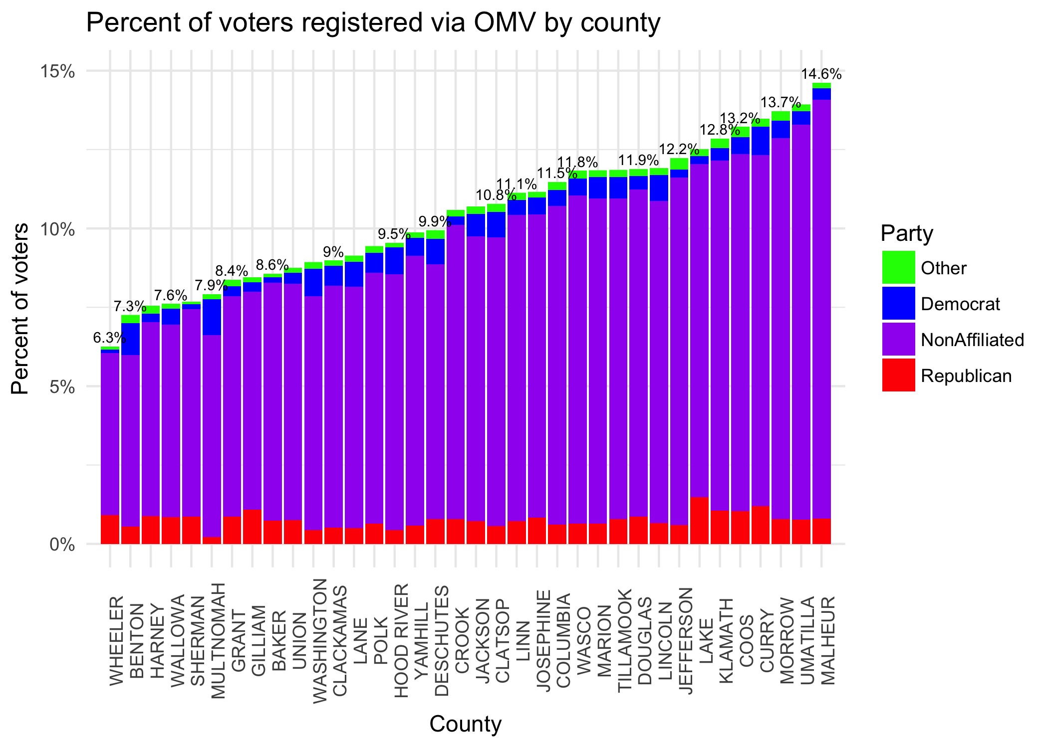
Clearly, most voters are registered as Nonaffiliated, meaning they never opted into a party affiliation. It’s also interesting that OMV is so effective is rural counties. To check whether this is a true trend, or just a function of small population in those counties, we can plot the total number of registered voters against the percentage of voters registered automatically.
or_voter_county2 <- or_voter_county %>%
  group_by(COUNTY_REGI) %>%
  summarise(MV_PROP = mean(TOTAL_PROP))

temp <- or_voter %>%
  group_by(COUNTY_REGI) %>%
  summarise(TOTAL = n())

or_voter_county2 <- or_voter_county2 %>%
  left_join(temp, by = "COUNTY_REGI")

ggplot(or_voter_county2, aes(TOTAL, MV_PROP)) +
  scale_x_log10(expand = c(.05, .15)) +
  geom_point() +
  geom_text(aes(label = COUNTY_REGI), check_overlap = TRUE, nudge_y = .0026) +
  labs(title = "Percent of voters registered via OMV",
       x = "log(Total registered voters)",
       y = "Percent of voters") +
  scale_y_continuous(labels = percent) +
  theme_minimal()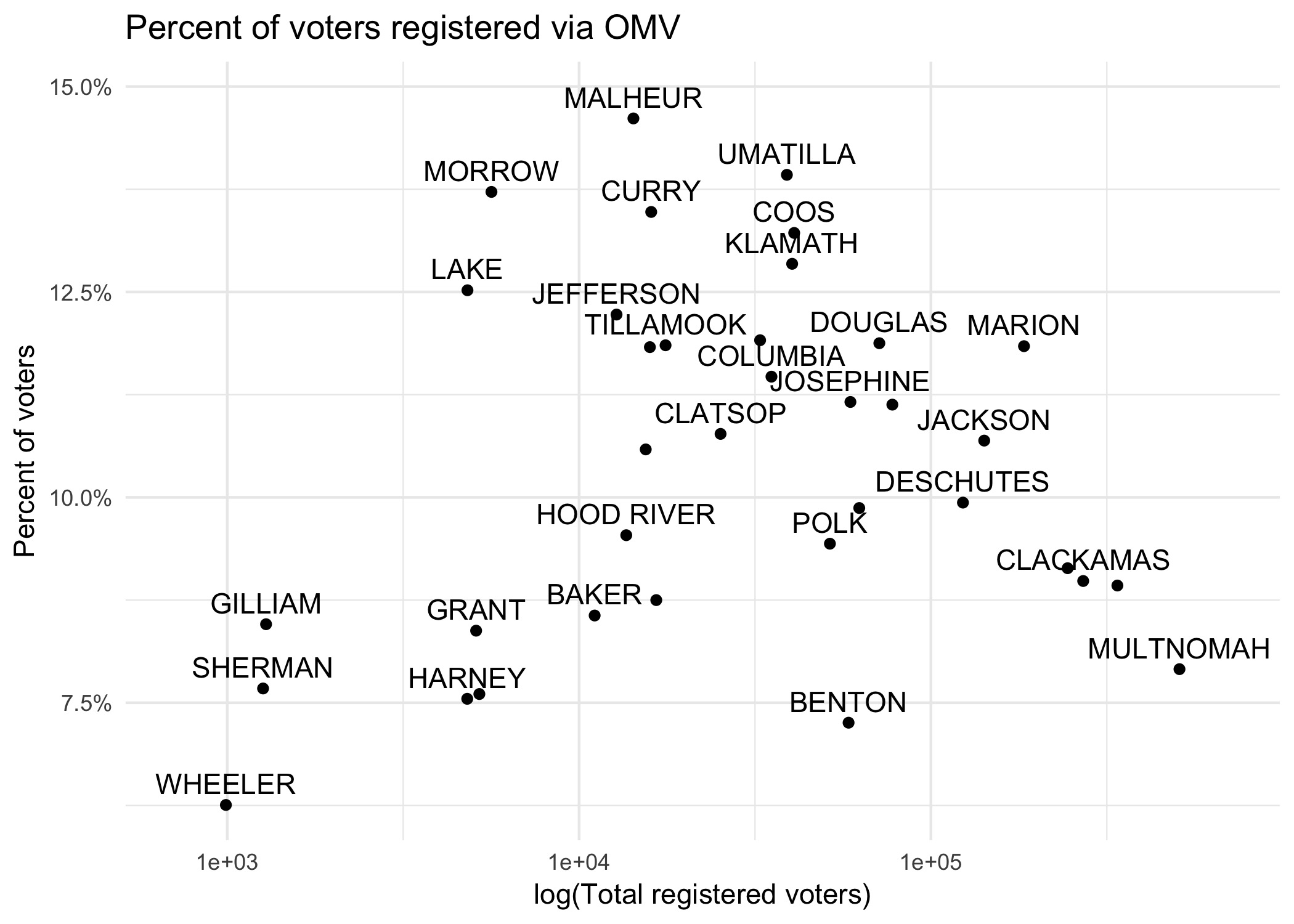
The log transformation of the x-axis prevents huge counties in the Portland metro area from dominating the plot, so we can get a better sense of the relationship between these two variables. To my eye, it seems that there is no meaningful correlation here. Additionally, Malheur county (which has the highest proportion of OMV registrants) seems to be the extreme end of a sizable cluster, so is not that unusual. Therefore, I come to the conclusion that Oregon’s automatic voter registration program is more effective in rural counties like Malheur.