
In 1861 the small town of Hagelloch, Germany experienced a measles outbreak. A doctor very carefully recorded the time of infection and symptoms for each patient.1 In the 1990’s, another German doctor went through all this data and was able to deduce the source of infection of each child.2 This data set gives us a wealth of information about the spread of disease, but it also allows us the rare opportunity to view disease as spreading over a network.
We can load this data set from the surveillance package for epidemiological modeling.
library(surveillance)
data("hagelloch")
This loads two data sets, hagelloch and hagelloch.df. The hagelloch data frame is a transformed version of hagelloch.df used for SIR modeling in the surveillance package. The one that we’re interested in is hagelloch.df, so let’s take a look at the first few rows:
head(hagelloch.df)## PN NAME FN HN AGE SEX PRO ERU CL DEAD IFTO SI
## 1 1 Mueller 41 61 7 female 1861-11-21 1861-11-25 1st class <NA> 45 10
## 2 2 Mueller 41 61 6 female 1861-11-23 1861-11-27 1st class <NA> 45 12
## 3 3 Mueller 41 61 4 female 1861-11-28 1861-12-02 preschool <NA> 172 9
## 4 4 Seibold 61 62 13 male 1861-11-27 1861-11-28 2nd class <NA> 180 10
## 5 5 Motzer 42 63 8 female 1861-11-22 1861-11-27 1st class <NA> 45 11
## 6 6 Motzer 42 63 12 male 1861-11-26 1861-11-29 2nd class <NA> 180 9
## C PR CA NI GE TD TM x.loc y.loc tPRO tERU tDEAD
## 1 no complicatons 4 4 3 1 NA NA 142.5 100.0 22.71242 26.22541 NA
## 2 no complicatons 4 4 3 1 3 40.3 142.5 100.0 24.21169 28.79112 NA
## 3 no complicatons 4 4 3 2 1 40.5 142.5 100.0 29.59102 33.69121 NA
## 4 no complicatons 1 1 1 1 3 40.7 165.0 102.5 28.11698 29.02866 NA
## 5 no complicatons 5 3 2 1 NA NA 145.0 120.0 23.05953 28.41510 NA
## 6 bronchopneumonia 3 3 2 1 2 40.7 145.0 120.0 27.95444 30.23918 NA
## tR tI
## 1 29.22541 21.71242
## 2 31.79112 23.21169
## 3 36.69121 28.59102
## 4 32.02866 27.11698
## 5 31.41510 22.05953
## 6 33.23918 26.95444There’s a lot here, but for the moment, let’s just focus on the PN and IFTO columns. A quick look at documentation for this data (?hagelloch.df) tells us that the PN column is a unique patient identifier and that the IFTO column is the number of the patient who is considered to be the source of infection. This gives us everything we need to make a network! Using the statnet suite of packages, we can make a network object using the PN and IFTO columns as an edge list. This is basically just a list of all the edges in the network as ordered pairs of vertices.
edges <- hagelloch.df %>%
  select(IFTO, PN) %>%  # edge lists take the source of the connection first
  filter(!is.na(IFTO)) # not every patient has a known source of infection

measles_net <- network(edges, matrix.type = "edgelist")

my_arrow <- arrow(length = unit(.1, "inches"), type = "closed")
ggraph(measles_net) +
  geom_edge_link(arrow = my_arrow, end_cap = circle(1, "mm")) +
  geom_node_point(color = "red") +
  theme_no_axes()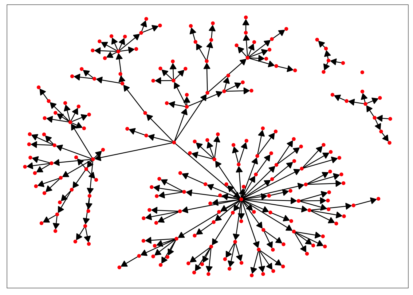
Great! We’ve made a network that represents the spread of measles during the outbreak, but what does it tell us? Right now, not much. We can see who infected who, but without knowing more about the individual patients, we can’t really learn a lot about how the disease spread. Taking a second look at our data frame, it seems like there’s a few covariates that could be of interest. We’ll pull out AGE, SEX, and CL (which class in school the child was in) and add them to our network as vertex attributes.
vertex_attrs <- hagelloch.df %>%
  select(AGE, SEX, CL) %>%
  mutate(SEX = as.character(SEX), CL = as.character(CL))

measles_net %v% names(vertex_attrs) <- vertex_attrs

plot_base = ggraph(measles_net) +
  geom_edge_link(arrow = my_arrow, end_cap = circle(1, "mm")) +
  theme_no_axes()

plot_base + geom_node_point(aes(color = SEX), size = 3)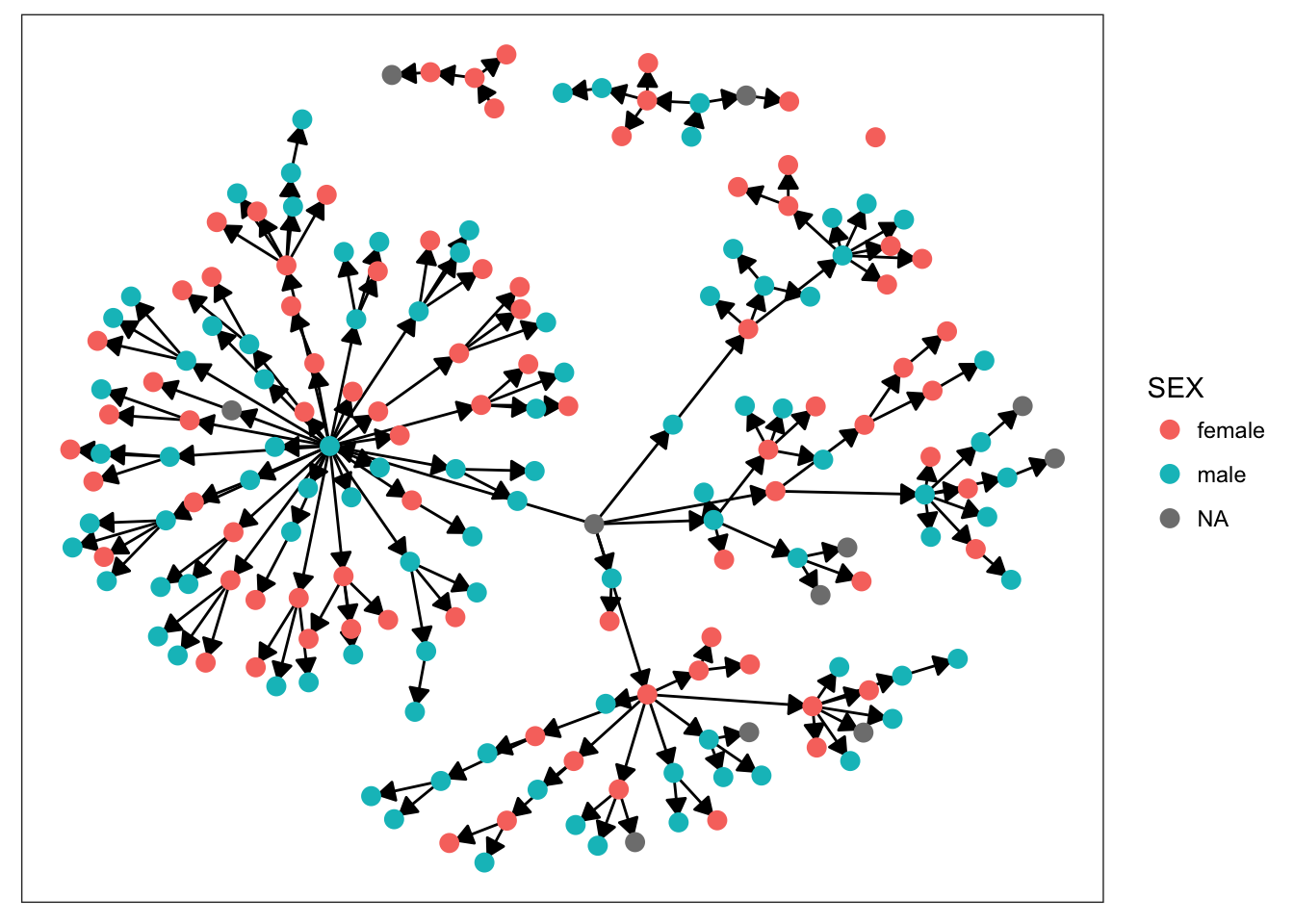
plot_base + geom_node_point(aes(color = AGE), size = 3)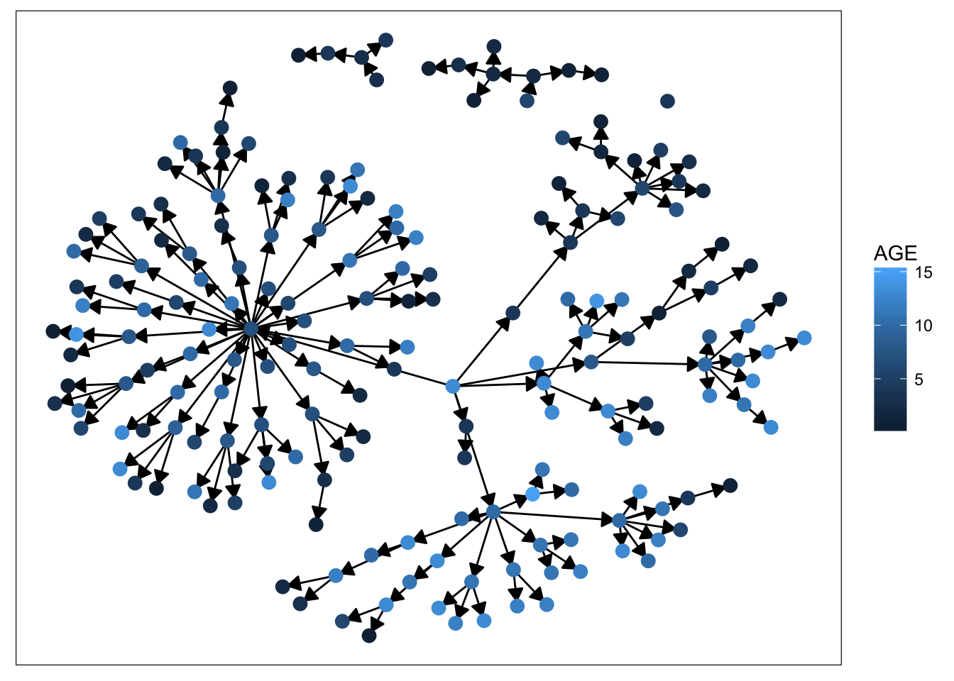
plot_base + geom_node_point(aes(color = CL), size = 3)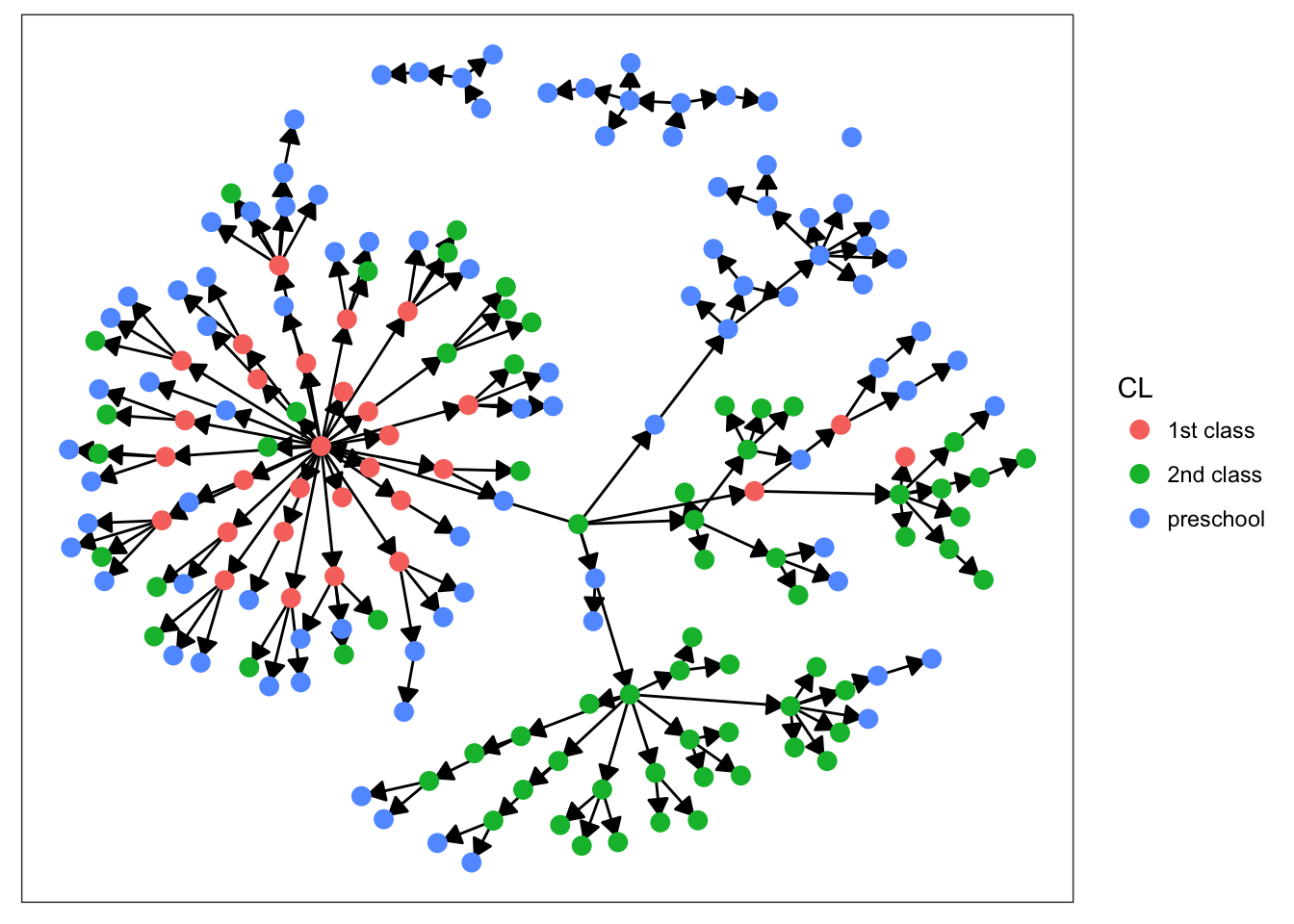
Starting with sex, we can see that there’s not much clustering of the colors. It looks like kids with measles weren’t more likely to spread the disease to others of the same sex. Age is more promising, however. We definitely see clumps of darker and lighter blues, indicating that children tended to infect other kids close to them in age. This pattern makes more sense when we look at the final plot. There’s definitely a strong clustering effect based on class in this network. Intuitively, this seems very plausible. Where do kids get sick? At school. Who infects them? Their classmates.
Looking at that final plot was informative, but this network has another dimension that a static plot can’t capture. The spread of disease occurs over time. To visualize this, we need to make our network dynamic. Luckily, statnet includes tools for this. We can use the networkDynamic package that’s loaded when statnet is. This package allows us to easily add vertex and edge attributes in the form of “spells,” which define when that vertex or edge is active in the network. Here, we activate the edge at the time it was infected.
measles_net_dynamic <- measles_net # copy our network

for(i in seq_along(hagelloch.df[["tR"]])){
  if(!is.na(hagelloch.df[[i,"IFTO"]])){
    activate.edges(measles_net_dynamic,
                   onset = floor(hagelloch.df[[i, "tI"]]), # tI contains jittered time of infection
                   terminus = Inf, # Edges stay active forever
                   e = get.edgeIDs(measles_net_dynamic, v = hagelloch.df[[i,"IFTO"]], alter = i))
                   # which edge are we talking about
  }
}
Now we can plot this with the ndtv package and watch the infection evolve over time. In this animation, the black nodes are those in the first class, red corresponds to the 2nd class, and green represents preschool.
library(ndtv)

render.d3movie(measles_net_dynamic,
               plot.par = list(vertex.col = "CL",
                               displaylabels = FALSE,
                               vertex.tooltip = measles_net %v% "CL"),
               output.mode = "htmlWidget")
## slice parameters:
## start:7
## end:45
## interval:1
## aggregate.dur:1
## rule:latestWe can also visualize what the infectious population looks like at each time by setting edges to only be active when nodes they are connected to are infectious. We’ll make a similar animation, but here the edges will only last during the infectious period of the nodes and we’ll color infectious nodes red and non-infections nodes gray.
measles_net_dynamic2 <- measles_net

for(i in seq_along(hagelloch.df[["tR"]])){
  if(!is.na(hagelloch.df[[i,"IFTO"]])){
    activate.edges(measles_net_dynamic2,
                   onset = floor(hagelloch.df[[i, "tI"]]),
                   terminus = floor(hagelloch.df[[i, "tR"]]), # now edges end when no longer infectious
                   e = get.edgeIDs(measles_net_dynamic2, v = hagelloch.df[[i,"IFTO"]], alter = i))
  }
}

col_fun <- function(slice){
  # a function that takes the network at a given time and
  # colors the nodes red if they're infectious and gray
  # otherwise
  colors <- rep("gray", network.size(slice))
  edges <- as.edgelist(slice)
  for(i in 1:network.size(slice)){
    if(i %in% edges[,1] || i %in% edges[,2]) colors[i] <- "red"
  }
  return(colors)
}

render.d3movie(measles_net_dynamic2,
               plot.par = list(
                 vertex.col = col_fun
               ),
               output.mode = "htmlWidget")
## slice parameters:
## start:7
## end:53
## interval:1
## aggregate.dur:1
## rule:latestHere we can see that children tend to infect a small number of other people, which is visible in the network as many small clusters of nodes apearring and disappearing. However, it is interesting to note that there is one outlier, node 45, who infected 30 people. Judging from this animation, it seems like this infection was a catalyst for the rest of the outbreak. A few days after all of the children infected by node 45 became infectious, we see the sudden spread of infection throughout a large part of the network and the development of many small clusters of red nodes.
This data set presents a unique opportunity to investigate the spread of a disease through the lens of network analysis. These visualizations are only the first step towards identifying interesting aspects of the network to model. For example, a 2012 paper examined this data set as representing a partial observation of a pre-existing underlying social network and applied Bayesian methods to model sociological and epidemiological characteristics of the population and the outbreak.3
Pfeilsticker, A. (1863). Beiträge zur Pathologie der Masern mit besonderer Berücksichtigung der statistischen Verhältnisse, M.D. Thesis, Eberhard-Karls-Universität Tübingen. Available as http://www.archive.org/details/beitrgezurpatho00pfeigoog.↩
Oesterle, H. (1992). Statistische Reanalyse einer Masernepidemie 1861 in Hagelloch, M.D. Thesis, Eberhard-Karls-Universitäat Tübingen.↩
Groendyke, C., Welch, D. and Hunter, D. R. (2012), A Network-based Analysis of the 1861 Hagelloch Measles Data. Biometrics, 68: 755–765. doi:10.1111/j.1541-0420.2012.01748.x↩